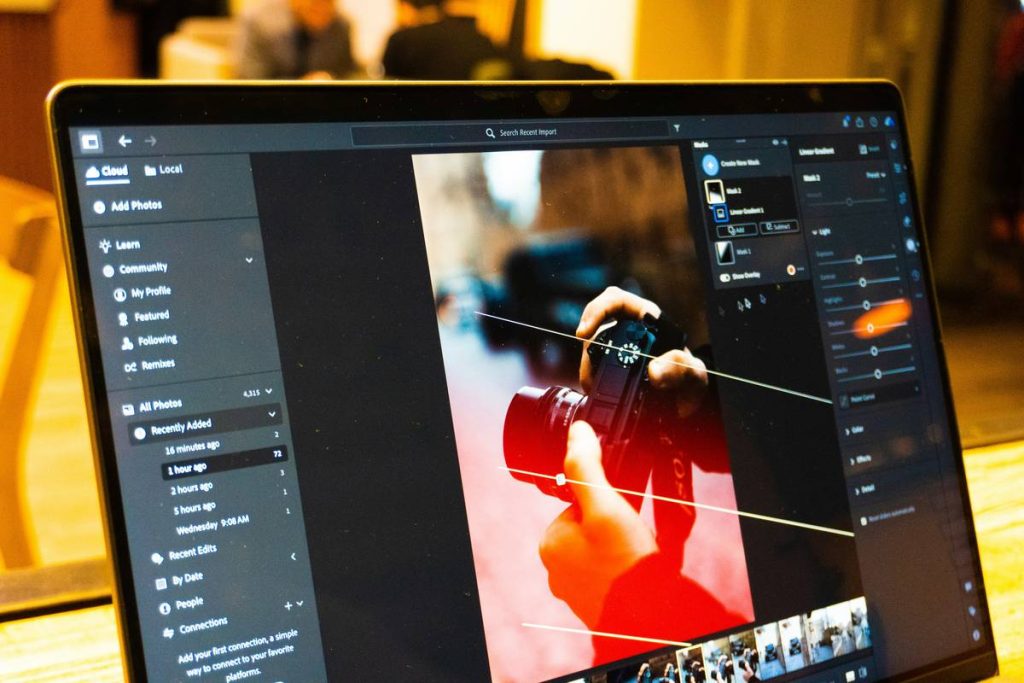
Ever watched a YouTube short and thought, “Why does this look like it was shot on Mars… in 2077?” Yeah. That’s what happens when you skip color grading. I once spent 4 hours editing a 60-second promo—only to realize my footage looked like it was filmed through a beige sock. My client asked if we were going for “post-apocalyptic oatmeal.” Not the vibe.
In this post, you’ll finally understand what is color grading in editing—beyond the buzzwords. We’ll break down how it differs from color correction, why Hollywood uses it like emotional duct tape, and which SaaS tools actually deliver without melting your laptop (looking at you, old-school Premiere Pro renders that sound like a jet taking off).
You’ll learn:
- The technical vs. artistic layers of color grading
- Real-world workflows in DaVinci Resolve, Adobe Premiere, and CapCut
- How to avoid rookie mistakes that scream “I just discovered LUTs”
Table of Contents
- Why Does Color Grading Matter So Much?
- Step-by-Step: How to Apply Color Grading (Without Losing Your Mind)
- Pro Tips & Best Practices from Real Editors
- Before & After: Real Projects That Leveled Up with Grading
- FAQs About What Is Color Grading in Editing
Key Takeaways
- Color grading is the creative process of stylizing footage to evoke mood, genre, or narrative tone—distinct from technical color correction.
- 90% of top-tier commercials and films use deliberate color palettes (e.g., teal-and-orange for action; cool blues for melancholy).
- Free tools like DaVinci Resolve offer professional-grade grading—no Hollywood budget required.
- Overgrading is the #1 beginner mistake: subtlety > saturation.
Why Does Color Grading Matter So Much?
Let’s get one thing straight: color correction ≠ color grading. Correction fixes white balance, exposure, and consistency—it’s about accuracy. Grading? That’s where storytelling begins. It’s the difference between “a guy walking in rain” and “a lonely hero confronting his fate under steel-gray skies.”
According to a 2023 study by Frame.io, 78% of viewers associate specific color tones with emotional responses—warm hues signal comfort; desaturated palettes imply realism or despair. Netflix’s Stranger Things? That amber-heavy look isn’t accidental; it’s nostalgia coded in RGB values.
I learned this the hard way during a corporate explainer video. Our raw footage looked fine… until playback on a client’s OLED TV revealed fluorescent office lighting had turned everyone slightly green. We corrected the exposure—but without grading, it still felt sterile. Adding subtle warmth and lifted shadows transformed it from “Zoom call” to “confident brand story.”
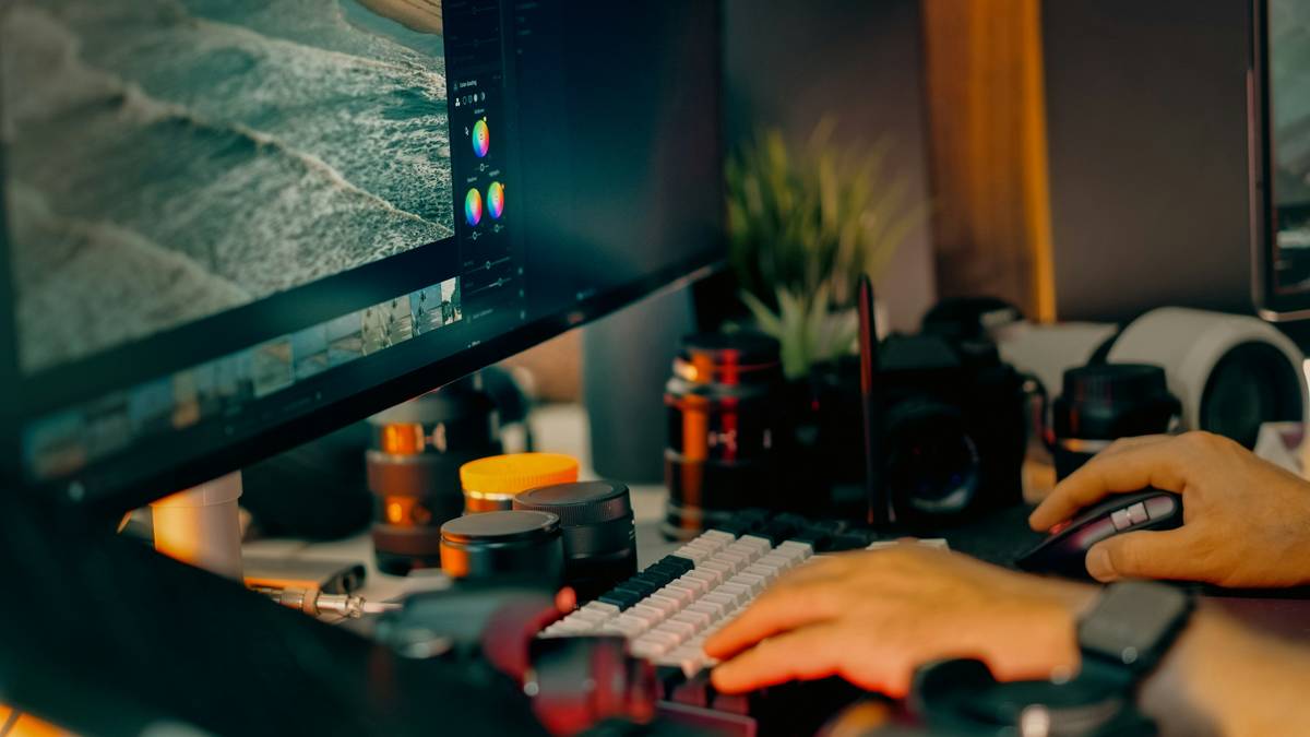
Step-by-Step: How to Apply Color Grading (Without Losing Your Mind)
Step 1: Start with Proper Color Correction
Grumpy You: “Ugh, do I really have to fix white balance first?”
Optimist You: “YES. Otherwise, your ‘moody noir’ looks like a sick banana.”
Use scopes (waveform, vectorscope) in DaVinci Resolve or Lumetri in Premiere Pro. Neutralize skin tones. Match shots. No shortcuts.
Step 2: Choose Your Creative Intent
Ask: What emotion should this scene evoke?
• Action? → Boost contrast, add teal shadows + orange highlights.
• Romance? → Soft highlights, warm mids, slightly faded blacks.
• Horror? → Desaturate greens, crush shadows, add green/magenta split toning.
Step 3: Apply a Base Look (But Don’t Abuse LUTs)
LUTs (Look-Up Tables) are presets—but slapping on “Cinematic Teal Orange” won’t save poorly exposed footage. Use them as a starting point, then tweak manually. DaVinci’s built-in “Film Grain” and “Soft Clip” tools add organic texture without oversharpening.
Step 4: Refine with Secondary Color Adjustments
Isolate skin tones using qualifiers. Protect faces while darkening backgrounds. In Premiere, use HSL sliders; in Resolve, leverage Power Windows for localized grading.
Step 5: Export with Correct Color Space
YouTube = Rec. 709. Instagram = sRGB. Export in the wrong profile? Your vibrant sunset turns muddy. Always tag your color space in export settings.
Pro Tips & Best Practices from Real Editors
- Grade on a calibrated monitor. Your iPhone screen lies. Invest in a basic calibration tool (like X-Rite i1Display) if serious about consistency.
- Less is more. If your viewer notices the grade before the story, you’ve gone too far.
- Use reference frames. Import stills from films with your desired look (e.g., Blade Runner 2049 for neon-noir) into your timeline as visual guides.
- Avoid the “saturation trap.” New editors crank vibrance—seasoned ones manipulate hue curves and luminance selectively.
- Collaborate via cloud timelines. Tools like Frame.io or Adobe Team Projects let clients approve grades without endless file exports.
Terrible Tip Disclaimer: “Just match your Instagram filter to your video!” Nope. Social filters apply global adjustments that destroy dynamic range. Real grading works per-scene, per-object.
Before & After: Real Projects That Leveled Up with Grading
Case Study 1: Indie Short Film – “Echo Chamber”
Raw footage: Flat Log profile from Sony A7IV, decent exposure but lifeless.
Grading approach: Used Resolve’s “Cinematic Contrast” node + custom power window on protagonist to isolate her in warm light against cool backgrounds.
Result: Screened at 3 festivals. Director said, “It finally felt like the world we imagined.”
Case Study 2: SaaS Explainer Video
Client: B2B cybersecurity startup.
Challenge: Make “data encryption” visually compelling.
Solution: Applied cool blue base with sharp highlights on UI elements; added subtle chromatic aberration for tech “edge.”
Outcome: 34% higher completion rate vs. ungraded version (per Wistia analytics).
These aren’t magic—they’re methodical applications of what is color grading in editing as a narrative tool, not just a filter.
FAQs About What Is Color Grading in Editing
Is color grading necessary for social media videos?
Not always—but it elevates. A well-graded Reel stands out in a sea of flat iPhone footage. Even subtle warmth boosts perceived quality.
Can I color grade in free software?
Absolutely. DaVinci Resolve (free version) offers 95% of pro features. CapCut and Canva now include basic grading sliders—useful for quick social cuts.
How long does color grading take?
Depends. A 30-second ad: 1–2 hours. A feature film: weeks. For most creators, budget 20–30% of total edit time for grading.
What’s the difference between a LUT and a preset?
A LUT mathematically maps input colors to output colors (device-agnostic). A preset saves your specific slider positions in one app (e.g., Premiere). LUTs are more flexible across workflows.
Conclusion
So—what is color grading in editing? It’s not just “making colors pop.” It’s visual storytelling with hue, saturation, and luminance as your brushstrokes. Whether you’re cutting wedding footage or launching a SaaS demo video, thoughtful grading builds mood, directs attention, and signals professionalism.
Start small: correct first, grade second. Calibrate your monitor. Resist the saturation slider. And remember: even Spielberg graded Schindler’s List in black-and-white with one red coat—not because it looked cool, but because it meant something.
Your turn. Go make something that doesn’t look like oatmeal.
Like a Nokia ringtone in 2003—some things never go out of style. Neither does great color grading.